Please note that this preview was written before the MPC Touch was actually released – I have now written a complete hands-on review of the Akai MPC Touch including a closer look at the new Touch UI.
In this Akai MPC Touch preview, I’m going to look at how the forthcoming MPC Touch controller stacks up against the MPC Renaissance and MPC Studio based on the specifications Akai have released so far.
Quick Recap – Music Production Controller
It’s important to note that Akai’s new generation of ‘MPCs’ are NOT standalone units like the classic legacy MPCs of the past. They are software controllers, designed to control one piece of software; the imaginatively named MPC Software.These MPC controllers will do nothing unless they are attached via USB to your computer with the MPC Software application up and running. Once connected you can control (most of) the MPC software from the hardware (which includes a built in screen) or if you prefer, you can work directly in your computer with your mouse (or a bit of both, e.g. use the hardware while looking at the computer screen). So you are definitely tied/chained/locked-in to your computer when using these MPCs. It’s the exact same model as used by Native Instrument’s Maschine.
I’m ignoring the MPC Element in this MPC Touch preview, simply because the MPC Element controls the MPC Essentials software which is a slightly different branch of the main MPC Software, more focused on functioning as a single track plugin instance within a DAW.
Size Does Matter!
At the time of writing there are no detailed specifications available for the MPC Touch but we can certainly gauge its size from the videos and from the fact that we know the screen is 7″ (measured diagonally from corner to corner).
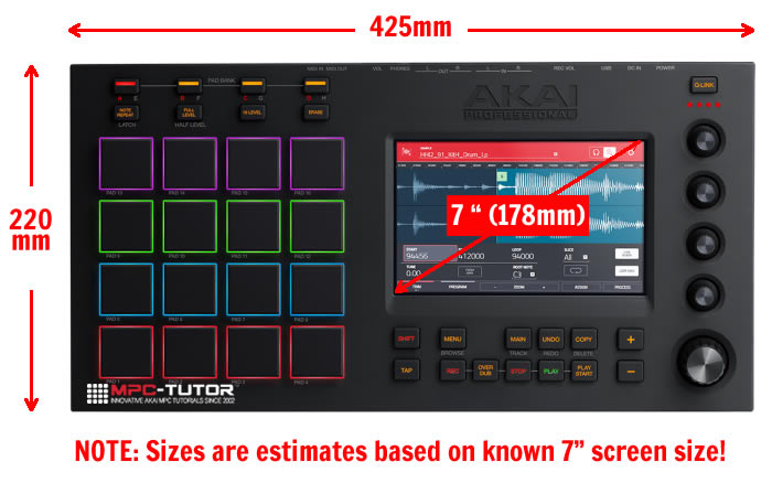
I estimate that the MPC Touch is approximately 425mm x 220mm x 30mm, which makes it slightly larger than a Maschine Micro and certainly much less bulky than an MPC Renaissance. Weight-wise, I’m going to assume it’s significantly lighter than the MPC Renaissance. If you are looking for a highly portable MPC that takes up the least desk space, the MPC Studio is still the favourite, but the MPC Touch is still no slouch in that department.
MPC Touch Screen
When it comes to the hardware screen it’s clear that the MPC Touch is in a league of its own. I posted about the benefits of having a touch screen on an MPC back in 2013 (I even guessed the correct size), so I’m chuffed to see this feature make its way to the MPC. Even ignoring the multi-touch aspects, a full colour, 7″, high resolution screen simply makes the MPC Studio and MPC Renaissance quiver in complete embarrassment. Don’t get me wrong, it’s not like the older style screens were unusable, but times change and when we’re seeing these types of screens on budget tablets, it seemed laughable that MPCs were still using these rather basic low resolution LCDs.
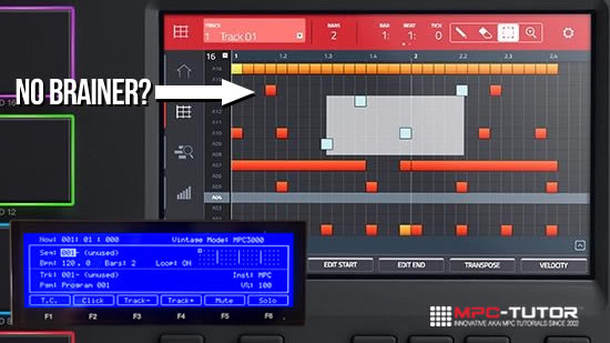
When it comes to the touch capabilities, we’ll have to see how well Akai have implemented this and I suspect there’s going to be a few firmware updates to iron out some of the quirks, but the potential benefits of a touch screen are mouthwatering. For a start, old school MPCs only had a finite number of buttons available so any new software features needed to work within those confines. Akai came up with the ‘double tap’ workaround for the MPC Renaissance and MPC Studio, but that still has its limits. However now we effectively have unlimited buttons of any size, shape or colour, so if Akai were to implement (for example) a completely new ‘Mode’ to the MPC Software (like they did when they introduced Pad Perform mode or MIDI Control Mode) the button to access this mode can simply be added to the existing touchscreen menus.
You’ve not doubt seen from the promo videos that we’ll be able to edit waveforms on screen, as well as use your fingers to add and manipulate the events in the main Sequencer grid, so this will no doubt lend itself to a different and hopefully more efficient workflow styles. It remains to be seen whether these features simply turn out to be cool gimmicks or essential elements to people’s creative workflows.
A touch screen also have interesting live performance benefits. I believe the MPC Touch already has some kind of on-screen live effect manipulation (Kaoss Pad style?) which should be amazing, and in the future I hope they will implement fully configurable virtual Q Link sliders (I miss my sliders), and maybe some kind of sample scratch pad (i.e. live scratching with any sample). Feel free to add your own ideas to the comments section!
So the MPC Studio and MPC Renaissance certainly seem rather tame in this respect, but it is important to note that from the very first MPC we’ve always used small low resolution screens and they clearly did the job they were designed for, so not having a touch screen does not necessarily make any older MPC ‘obsolete’ – as we say in good old Blighty, ‘proof is in the pudding’, so the only way you’ll know if the touch screen workflow works better for you is to try it out once these units start appearing in your local music store.
MPC Ergonomics
As MPCs get smaller and smaller and more minimal, the issue of ergonomics becomes a more pressing concern. Just how usable are these things? As an owner of both the MPC Studio and MPC Renaissance, I can assure you that while I love the space-saving compactness of the MPC Studio, I absolutely HATE using those poxy Q links. Apart from the fact that their low profile makes them almost impossible to use from a performance perspective, the endless scrolling to access the three columns of ‘virtual’ Q links means it an absolute chore doing any kind of editing work using the Q links. The flat data wheel is also a nightmare to use, so even the data wheel/cursor editing method is a chore on the MPC Studio.
The MPC Touch appears to address some of these problems by adopting more tactile, raised Q link and data wheel dials, but judging by those 4 red LEDs above the Q Links, it seems the remaining 12 Q-links remain ‘virtual’ – this of course might not be a problem if the touchscreen does away with the need for all those extra physical dials. Otherwise the MPC Renaissance appears to be the winner in this respect with it’s sixteen dedicated Q link dials.
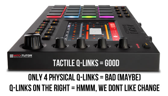
An interesting change is the shift in the position of the Q links to the right side of the machine compared to the traditional left. This may present a problem to seasoned MPC users who are used to using their left hand for all Q Link duties, but I’m not convinced this will be much of an issue and people will just adapt. I’ll cover this in more detail when I get to do a proper hands on review of the MPC Touch.
Interestingly, especially for those who prefer the cursor/data wheel method of editing samples, there are no dedicated cursor keys on the MPC Touch, which I assume means Akai have decided to completely offload all screen navigational aspects to the touch screen. This might take some getting used to as long time MPC users have the cursor keys embedded into their muscle memory.
Talking of the data wheel, the MPC Renaissance data wheel is by far and away the best data wheel ever produced by the ‘inMusic Brands’ Akai, and it looks like the MPC Touch data wheel is of a similar design and hopefully has the same feel and action.
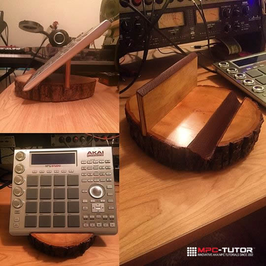
An ongoing concern that harps all the way back to the MPC2000 is the lack of tilt screen and how it may lead to problems with posture over long periods of use, as people sitting at a desk will have to hunch over to read the screen. One solution has been to place the MPCs on a tilted stand, although the downside to this method has been a reduction in stability and having to deal with playing the pads themselves at an angle. Here’s the latest DIY MPC Studio stand from MPC-Forums member Dvon (which is admittedly quite stable in use!):
To tackle some of this issue, the MPC Touch ships with a separate small stand that can be used to tilt the MPC Touch at a slight angle – it’s literally just a long piece of plastic which adds approximately 1 inch of height at the rear by placing it underneath the the MPC Touch, it can be seen around the 2 minute mark in the following MPC Touch unboxing video:
One thing the MPC Renaissance most definitely wins on is the inclusion of a palm rest. Yes, it does make a huge difference to have somewhere to rest your palms while working (certainly when sitting at your MPC).
General Hardware Features
When it comes to audio, the MPC Studio has to sit in the corner, as both the MPC Renaissance and MPC Touch come with a built in audio interface which can also be used as a system audio interface for your computer, or (should) happily work in unison with your computer’s existing audio interface. We know the MPC Renaissance’s interface is decent quality, but we’ll have to wait to see if the MPC Touch has the same ‘MPC3000 style circuitry’ that Akai have claimed they developed for the Ren. What is clear is that the MPC Touch does not have the wealth of audio inputs and outputs of the Renaissance, so there’s no dedicated Mic or Phono inputs, only 2-in-2-out and no digital ins/outs. The headphone socket is annoyingly at the back of the unit as well, as are the volume control and record gain. Other missing features include no dedicated MIDI ports (so like the MPC Studio you’ll need to use MIDI adapter cables, I assume these will be supplied), no footswitch socket, and no USB ‘hub’, so you will ‘lose’ a USB port when running the MPC Touch.
The MPC Studio does get bonus points for being the only controller that does not require a power supply unit (PSU), relying purely on USB to power it.
Finally it looks like the buttons on the MPC Touch are those horrible squiggy rubber things, while the Ren uses nice, solid hard plastic buttons that have that satisfying ‘click’ when you press them (although you might prefer the silence of the rubber buttons when working on headphones at night).
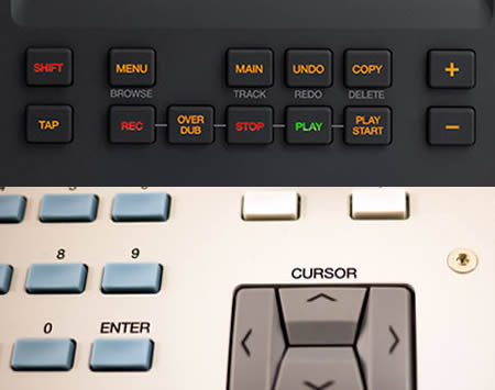
On the whole it seems that in the realm of the MPC ‘controller’ at least, the MPC Renaissance is still king of hardware.
MPC Touch vs MPC Studio vs MPC Renaissance – Which MPC Is Best?
If you are in the market for a cheap, portable and space saving MPC controller that gives you access to the full MPC Software, the MPC Studio is still the firm favourite, but you will need to supply your own audio interface.
Choosing between the MPC Touch and the MPC Renaissance is much more tricky. Obviously if you must have that touchscreen then the decision is made for you, but if you are just looking for the ‘best’ MPC Software controller, then you’ll really have to weigh up quite a few factors and decide which features are more important for you and the way you wish to work.
Pricing will no doubt come into play to many people; in the UK the MPC Touch is going to initially retail at £499 which is £130 cheaper than the current price for an MPC Renaissance, but in the USA the MPC Touch appears to be $100 more than a Ren. History has shown that MPC prices tend to plummet after the first few months (or even weeks), so we’ll have to see how the pricing eventually settles.
If build quality and lots of good traditional MPC features are important, the MPC Renaissance is probably still the MPC to go for. If you don’t need those hardware bells and whistles then the MPC Touch becomes very tempting, but a lot of its appeal is very much reliant on the touch screen experience being perfectly nailed. If Akai miss the mark, or people simply find the touchscreen experience too gimmicky, the MPC Touch may be find itself suffering the same fate as the failed MPC Fly.
On a final note, I think it’s worth pointing out that given the lack of ‘premium’ hardware features on the MPC Touch, there is clearly plenty of room for Akai to bring out a true touchscreen ‘flagship’ to completely blow the Renaissance out of the water on all fronts. The rumour mill keeps on insisting that there are more new MPCs to come, so, are we going to see a ‘Renaissance Touch’ soon? Perhaps a more compact unit with the same ‘tank-like’ build quality of the Ren, with the arm rest, full suite of audio ins/outs, quality buttons, cursor keys, 16 q-links and of course a titling touch screen? And what about the ultimate MPC for many, the ‘hybrid’ touchscreen MPC, one that can work both standalone or attached to a computer?
Keep on crossing those fingers…and remember that my constantly updated MPC Software tutorial book, ‘MPC: Sampling Laid Bare’ will also be suitable for the MPC Touch and any other future MPC that controls the MPC Software!


Oct 8, 2015 7:22 pm
Nicely done! Balanced, objective, informative and logically written. I’m an MPC Ren. owner, former MPC Studio owner. I purchased your guide “Sampling laid Bare”. Looking forward to the updates. I’m on the fence about the new Touch. I’m leaning towards keeping the Ren due to the wealth of ports, q-links and ergonomics. The touch screen seems a bit gimmicky. Sure it should help with sample chopping/editing, but the 16 q-links make that same task a breeze and I like viewing waveforms on my 27in and 32in screens better than on a 7in screen.
Oct 9, 2015 1:50 pm
I LOVE LOVE LOVE your overview of this touch. I’m happy akai is innovating and back for the long haul. It’s going to make NI step it up also which is GREAT for consumers.
Oct 9, 2015 5:21 pm
The reason I use my MPC Ren (as opposed to a Maschine Studio or even simply making beats within a DAW such as Logic or FL Studio) is because of the classic MPC workflow that I am accustomed to. Now it looks as if they are changing up that workflow considerably. I am a professional so I don’t have time to adapt to a whole new system. So while the MPC Touch unit looks amazing, the pads look great, and the screen looks futuristic and really cool, I really don’t see a need for it for someone like me.
Now if a Ren 2 comes along and I feel like it’s an upgrade and improvement on my current workflow, I will gladly pay up to 2k for something like that. At this point the MPC Touch feels more like a random lateral move that may entice first-time buyers, but there’s not much in it for current Ren and Studio users.
Oct 9, 2015 6:37 pm
Worse case scenario, the touchscreen just goes down in history as a fun experiment. However it might just be the missing link in a more modern MPC workflow and if Akai get it right, it could become a big part of future development. Either way I don’t see why it shouldn’t become standard – touch or no touch, it’s a 7″ high res colour screen, which is a huge improvement over the tiny, retro displays on the Ren/Studio. If some things prove too fiddly or awkward for the touch screen they can always tweak the software or even bring back some hardware features on the next model (e.g. the cursor keys).
Oct 17, 2015 2:30 pm
I have the MPC studio and the Renaissance in my studio and have been trying to weigh the pros and cons about the MPC touch and it’s definitely ( shall we say the changing of the guard ) when you compare the Renaissance to the touch. Either way I’m going to try the touch out to see if I like it and if it works with my work flow in the studio. Some of the features for the MPC touch I am abit skeptical about ( name one is the Q link knobs ) I’m so used to having them on the left side of the MPC. As for the touch screen I am very excited to see if it actually can increase my workflow as a Producer.
Oct 26, 2015 1:46 am
Interesting.. Looks like something I would love to use… I am still giving Bitwig a go, but it is still sitting back seat to my 2500 with large screen and JJOS 128xl..
If Akai released the MPC software for linux, then I may have to think again
Aug 8, 2016 3:11 am
Mpc 5000 is the last real MPC , after that its a computer , comes with all the jitter problem . Sorry I am not fan as everybody here.